26 Jan Seeing purple?
Got color?
It’s a black and white world outside, but there’s color to be found if you take time to look. Scarlet dogwood twigs and crimson sumac clusters, magenta tag alder clumps and gold and orange willow fronds stand out against the dark green of pine and spruce boughs, all anchored by the russet, tan and amber of dried grasses that poke through the snow-cover. Add a blue-sky backdrop and low winter light and it’s a perfect picture.
If that’s not enough color for you, Pantone just announced that “Ultra Violet” is 2018’s color of the year. According to the Pantone Color Institute, Ultra Violet is, “A dramatically provocative and thoughtful purple shade,” and “communicates originality, ingenuity, and visionary thinking that points us toward the future.”
No doubt we’ll be seeing a lot of purple this year, from paint colors to cosmetics, clothing to housewares.
“Nuanced and full of emotion, the depth of PANTONE 18-3838 Ultra Violet symbolizes experimentation and non- conformity, spurring individuals to imagine their unique mark on the world, and push boundaries through creative outlets.” Pantone added that Ultra Violet suggests the mysteries of the cosmos and evokes the vast and limitless night sky, of what is possible. Throughout history purple tones have been associated with mystical qualities, are often associated with mindfulness practice and are said to help energize communities and spark connection.
I say that’s a lot to ask of a color! But if a dose of Ultra Violet can spark creativity and connection, I’m all for it!
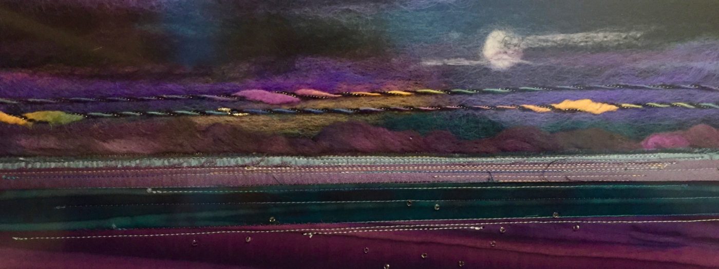
Image: “Night Energy,” fiber landscape by Linda Johaneson


Sorry, the comment form is closed at this time.